Wednesday 11 May 2011
Monday 9 May 2011
Friday 11 March 2011
Converting and Speed
To adjust the speed of different shots, I firstly converted the entire clip and then changed the speed by moving the speed bar up or down, in this case we moved the speed bar down to turn it into slow motion. As we are doing a trailer our entire sequence can't be too long so with some clips we made them quicker by moving the speed bar up, I didn't move it up too much, just enough so that it didn't look fake, this way we save more time for title pages and to try and get as much in as possible.
What's on a Poster?
When looking to make our horror film poster we needed to have looked at similar posters that we could find out what needs to be on them. below (like with the magazine cover) i have annotated a picture of a horror film poster which show the different components that we will need to include on our poster:
 By Bradley
Thursday 10 March 2011
What needs to be on a Magazine cover?
Conventionally on magazine covers there are many components that are necessary to portray to the public what they are. I am going to look at Magazine covers and what are needed on them to make them a conventional Magazine cover, so underneath i have annotated a picture of the leading film magaize company in the world's front cover from August 2008:

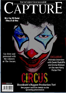
So now when creating our magazine cover publicising our film we know what we need to include on the cover.

So now when creating our magazine cover publicising our film we know what we need to include on the cover.
Friday 4 March 2011
StoryBoard
In our StoryBoard we decided to do a few title pages to break up the film, this leaves the audience questioning what is going to happen next. We thought this would give more emphasis to the genre of horror and looking at examples of horror trailers for example "Black Swan" we used this technique to make it look more professional.
Wednesday 19 January 2011
Film Poster Research
For our film trailer we have attempted to make it into a 'horror' genre. Typical horror film posters are mostly dark and ominous which adds to the tension of the film, and entices an audience into the production. Horror film posters don't let much on, and just show a scary image which gets the audience thinking about what it could be about.
The film poster which was developed for 'One Missed Call', reflects on the conventions which we have used for our film poster. The juxtaposition of the black background onto the white face makes an audience become instantly drawn in. At first glance, the image appears to be a strange looking man or a mask of some form, but at a closer look the audience notices the eyes are two screaming mouths, this also reflects on the horror genre as the mouths may show a representation of fear or terror. The white lettering of the title also shows a contrast along with the billing block underneath it.
Unlike the film poster for 'One Missed Call', the poster for 'The Last House on The Left', has elements of colour involved. The red colour of 'house' implies elements of danger, and sometimes in film posters colour adds to the sinister effect of the poster. The image of the house shows contrast with the way the lightening is hitting it behind it. Alike with this poster, we have used colour on our poster to add contrast and juxtaposition.
Our main influence for our film poster was 'The Dark Knight', as our film is aimed at a clown figure, the obvious influence would be this film. The colour of the face and make up of the clown draws attention to the clown and this is a convention we took for our poster. The date at the bottom and the billing block relates to our poster also. The contrasting images of the dark background against the white face and coloured smile make the poster look more scary and link to the horror genre.
Subscribe to:
Posts (Atom)


